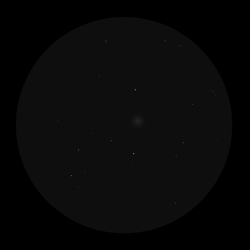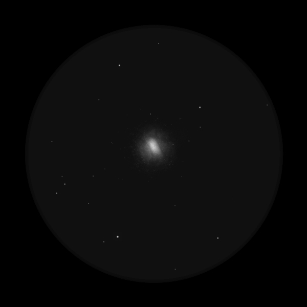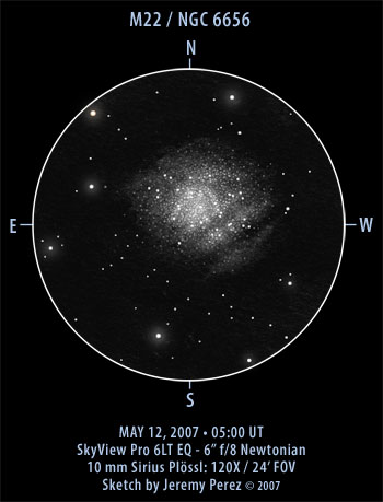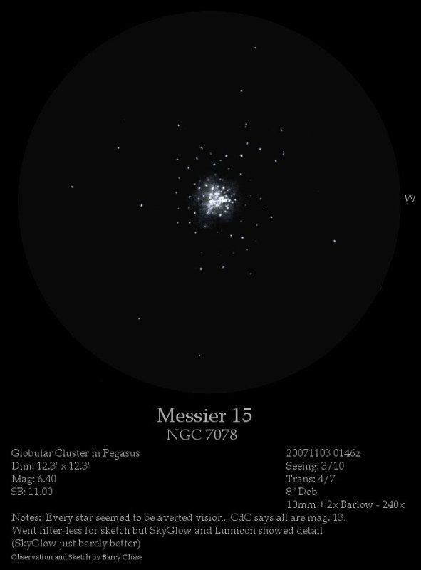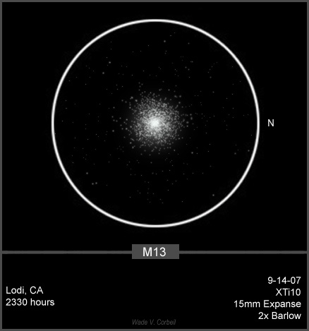
M13 – Globular Cluster
This was both a tough one and a fun one that presented some unique challenges. At
one time, I had a total of 21 layers and two separate documents in PhotoShop just to
get this thing looking halfway decent. My first challenge was, of course, the
Globular itself. I took notes to share some of the steps involved in digitizing this
sketch to share with others here.
Globular:
I started with a copy of my scanned image and reduced the opacity to 30 percent.
This allowed me to see the sketched image while making it transparent enough to see
the black background of the background layer.
I then created another layer behind the sketched image layer, chose the elliptical
selection tool and made a circle approximately ¾ the diameter of the globular
cluster, and filled it with 100 percent white. I then made a copy of this layer and
hid it for the time being. I then applied a Gaussian Blur of 9.7 to the first white
circle to soften it and create a glow. The opacity of the layer was then reduced to
30 percent to achieve a bright but subtle glow. I then used the blur tool with a
brush size of approximately 150, centered it over the blurred white circle, and
blurred the image a couple of times to get the proper effect.
I then made the copied white circle layer visible and applied a series of splatter
brush strokes to fill in the center of the globular. I’d make a brush stroke, copy
the layer, and rotated it 90°. I then applied another splatter brush; copied and
rotated until I got the star-scatter that closely resembled my original sketch. I
used the eraser tool quite a bit to get rid of stray or out-of-place stars.
I then created another layer and, using the paintbrush tool, used a variety of brush
sizes from 1-4 to add the stars immediately surrounding the Globular. The opacity
was changed from anywhere to 25 percent to 50 percent depending on the particular
stars or series of stars I was recreating and to create a bright, but not too bright
look to the stars.
I copied the above layer and set the opacity to 60 percent and set the layer mode to
difference. This softened the edges while maintaining a bright core to the stars.
Background Stars:
This is where the fun (and time) began. As many of the fainter stars were seen with
diverted (averted) vision, I had to create a way to try and make the stars appear as
I actually saw them. A weird combination of bright, but not so bright as to be
blinding, yet dim enough that it takes a second look to see them.
Once again, I started with the paintbrush tool set to a diameter of between 1 and 3,
and placed the stars as they appear in my original sketch. (Remember, the original
sketch is still visible on its own layer, just at a reduced opacity) The opacity of
these background stars never exceeded 60 percent. I tried to increase the opacity,
but then the stars started to look artificial.and definitely not how I actually saw
them.
I actually created 3 separate layers for this. One for a brush size of 1, another
for a brush size of 2, and the last for the brush size of 3. This way I could
control the opacity of the separate size/dimness of the stars separately without
effecting the entire digital star-field.
Once I had all my background stars in place, I linked the 3 layers, merged them
together, and made a copy. This made them stand out a little more, but still a
little too artificial, so I set the layer to overlay mode, and reduced the opacity
to 56 percent. I then merged all the background star layers, the globular layer, and
the blurred layer together. I then made a copy of this master layer.
I opened a new document in PhotoShop, and pasted the copied layer. I reversed the
image to a negative. Using the color picker, I removed all the white background,
leaving me with just the black reversed stars and Globular.
I then dragged and dropped this layer back into my original document. A quick Ctrl
+A+X+V cut and centered this negative image exactly over the original image. I then
moved the negative image behind the original, and applied a Gaussian Blur of 2.5.
This helped to darken the area behind the original stars and created a warm glow.
At this time, all layers except the black background layer were merged. I then used
the blur tool to soften those stars that still appeared too bright, as well as
utilizing the Burn and Dodge tools to adjust brightness as needed.
The result of all this is my digitized version of M13 based on my original sketch.
The original sketch took me about 30 minutes, and the digitized reproduction took me
roughly 30+ minutes. This has so far proven to be my most involved sketch and
digitized reproduction.
I hope it is acceptable.
Wade V. Corbeil
